Summary: Latitude vs. X
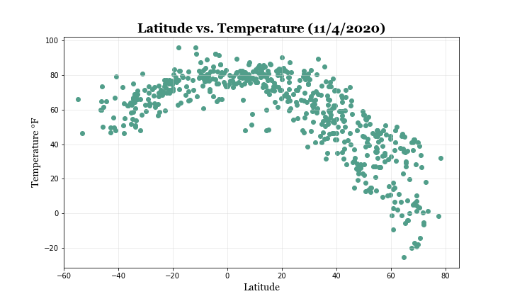
 "What's the weather like as we approach the equator?
"Now, we know what you may be thinking: "Duh. It gets hotter..."
But, if pressed, how would you prove it?
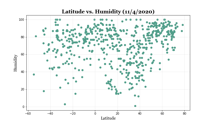
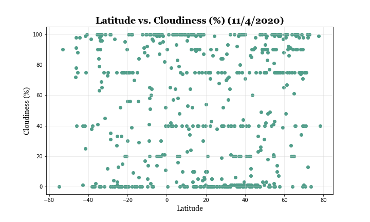
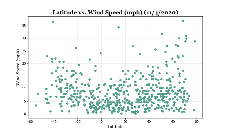
The purpose of this project was to prove just that and to further analyze these changes in weather as we get close to the equator.
First, I used the OpenWeatherMap API to pull the data for over 500 different cities. Once the dataset was assembled, I used Matplotlib to plot different aspect of the weather data. These aspects include: temperature, humidity, cloudiness, and wind speed.
This website displays the sourced data and visualizations created for the analysis. In addition to the explanations of the correlations and trends I observed.


